End Card Builder
Overview
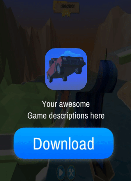
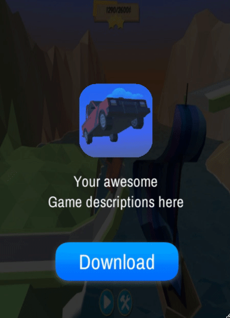
The Interactive End Card Builder is a tool developed by Luna for the Playable plug-in. Game developers can create and customize end cards for their playables instantly in the Unity editor.
Getting Started
- Install Playable Plugin into your Unity project.
- Download and import the Interactive End Card Builder into your Unity project.
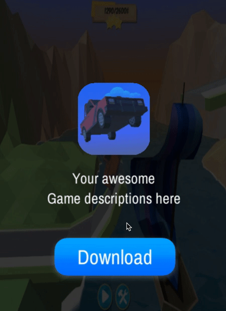
You can now see the Interactive End Card Builder folder in your Unity assets. If you want to test the builder, or have a play around with it, you can select the Scenes folder and open the the Example Scene.
The CanvasWithEndCard prefab can be dragged and dropped into your project hierarchy and integrated with your work. You can find it in the End Card folder, in the prefabs sub-folder.
End Card Call
It is necessary to call the end card in order for it to appear in the scene. Therefore, you can use the OpenEndCard() method in your script to instantiate the end card.
An example is available in the scripts folder: Example End Card Call.
End Card Configuration
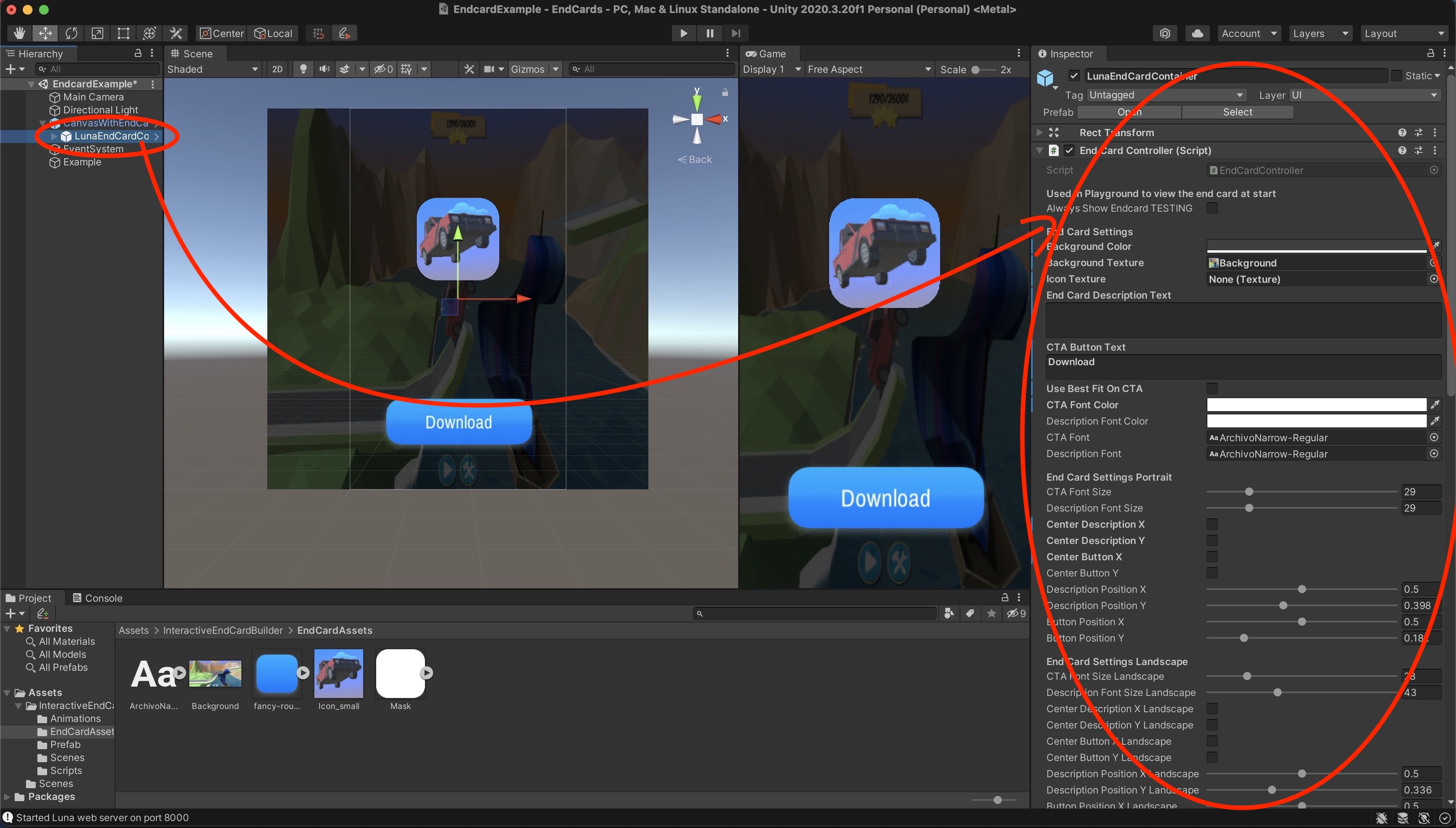
To configure an end card, you can select the prefab first child LunaEndCardContainer in the hierarchy. In this way the inspector will show you all the fields that can be modified in real time.
These fields are also divided between Portrait Settings and Landscape Settings according to what orientation is being used. These settings work in a similar way, they are only split in two groups in order to get different behaviors according to the considered orientation.
- Portrait
- Landscape
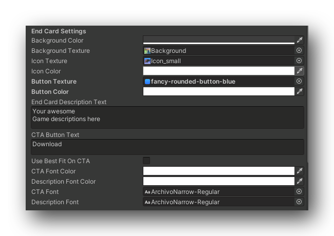
End Card Settings
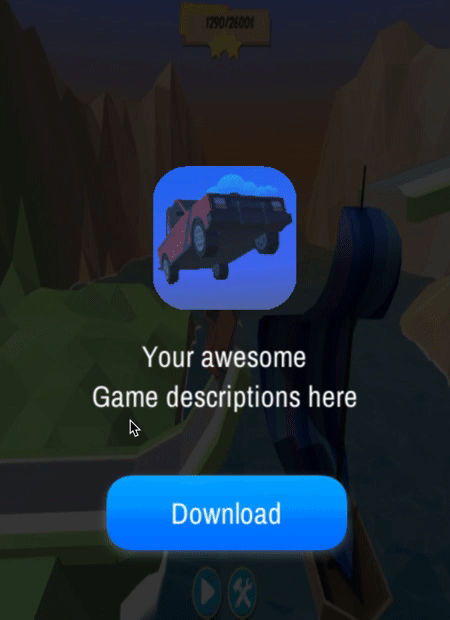
Use these variables to set your basic end card features (eg. background, icon texture, description, etc.).
| Field | Type/Options | Details |
|---|---|---|
| Always show Endcard | Boolean(true/false) | Mainly used for testing. Tick this option to make your end card to stay fixed in play mode. |
| Background color | Click on the color bar to open the color context menu and begin choosing a color. | The background colour and opacity of the end card. If you do not need a background you can set the alpha value to 0. |
| Background Texture | Image file(.png, .jpg, .jpeg, etc.) | You may upload a custom image to use for the end card. If your image includes text already on it be sure to set the End Card text color to transparent. |
| Icon Texture | Image file(.png, .jpg, .jpeg, etc.) | The image used for the icon in the end card. |
| Icon Color | Click on the color bar to open the color context menu and begin choosing a color. | The background colour and opacity of the end card's icon. |
| Button Texture | Image file(.png, .jpg, .jpeg, etc.) | The image used for the Button in the end card. |
| Button Color | Click on the color bar to open the color context menu and begin choosing a color. | The background colour for and opacity of the end card's button. |
| End Card Description Text | String (Letters, Numbers and Symbols) | The description text displayed under the icon and above the CTA button. |
| CTA Button Text | String (Letters, Numbers and Symbols) | The text displayed inside the CTA button. |
| Use Best Fit On CTA | Boolean(true/false) | Tick this box to automatically resize the button text to the best fit. |
| CTA Font Color | Click on the color bar to open the color context menu and begin choosing a color. | The color and the opacity of the CTA button text. If needed, you can set the opacity to 0 to remove the text. |
| Description Font Color | Click on the color bar to open the color context menu and begin choosing a color. | The color and the opacity of the description text. If needed, you can set the opacity to 0 to remove the text. |
| CTA Font | Font file(.ttf, .otf) | Drag & drop a font file in this field to change the font used by the CTA button text. |
| Description Font | Font file(.ttf, .otf) | Drag & drop a font file in this field to change the font used by the description text. |
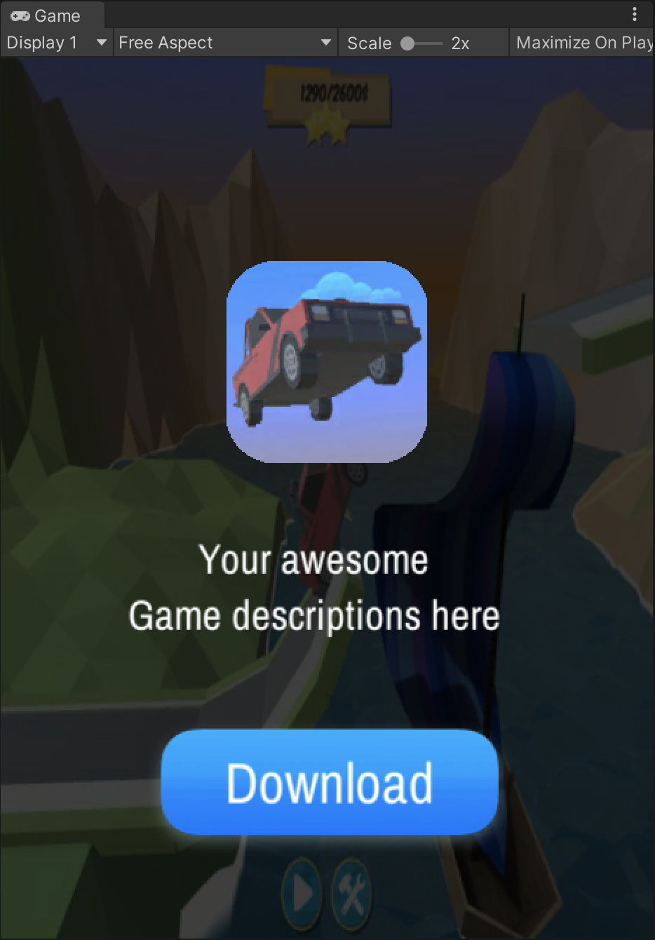
Portrait Settings
Use this settings to edit the appearance of the end card in portrait mode.
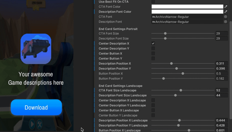
Landscape orientation fields will not update the end card's features while in portrait orientation.
Description and CTA Button
| Field | Type/Options | Details |
|---|---|---|
| CTA Font Size | Slider (which changes a float value) | The size of the CTA button text, the larger the value entered the larger the text will be. |
| Description Font Size | Slider (which changes a float value) | The size of the description text, the larger the value entered the larger the text will be. |
| Center Description X | Boolean(true/false) | Tick this box to center the description text along the X axis. |
| When this field is set to true, the description will be fixed in the center of the playable. Setting this back to false will allow this object to be moved along the X axis again. | ||
| Center Description Y | Boolean(true/false) | Tick this box to center the description text along the Y axis. |
| When this field is set to true, the description will be fixed in the center of the playable. Setting this back to false will allow this object to be moved along the Y axis again. | ||
| Center Button X | Boolean(true/false) | Tick this box to center the CTA button along the X axis. |
| When this field is set to true, the CTA button will be fixed in the center of the playable. Setting this back to false will allow this object to be moved along the X axis again. | ||
| Center Button Y | Boolean(true/false) | Tick this box to center the CTA button along the Y axis. |
| When this field is set to true, the CTA button will be fixed in the center of the playable. Setting this back to false will allow this object to be moved along the Y axis again. | ||
| Description Position X | Slider (which changes a float value) | Use the slider to translate the description text along the X axis. |
| Description Position Y | Slider (which changes a float value) | Use the slider to translate the description text along the Y axis. |
| Button Position X | Slider (which changes a float value) | Use the slider to translate the CTA button along the X axis. |
| Button Position Y | Slider (which changes a float value) | Use the slider to translate the CTA button along the Y axis. |
Icon
| Field | Type/Options | Details |
|---|---|---|
| Center Icon X | Boolean(true/false) | Tick this box to center the description text along the X axis. |
| When this field is set to true, the description will be fixed in the center of the playable. Setting this back to false will allow this object to be moved along the X axis again. | ||
| Center Icon Y | Boolean(true/false) | Tick this box to center the description text along the Y axis. |
| When this field is set to true, the description will be fixed in the center of the playable. Setting this back to false will allow this object to be moved along the Y axis again. | ||
| Icon Position X | Slider (which changes a float value) | Use the slider to move the icon along the X axis. |
| Icon Position Y | Slider (which changes a float value) | Use the slider to move the icon along the Y axis. |
| Icon Size | Slider (which changes a float value) | Move the slider to change the size the icon. |
| Round Edged On Icon | Boolean(true/false) | Tick this box to round the edges of your icon. |
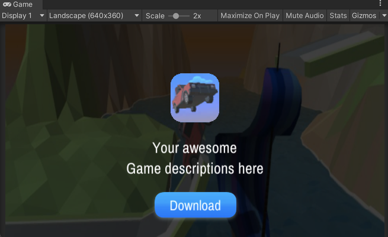
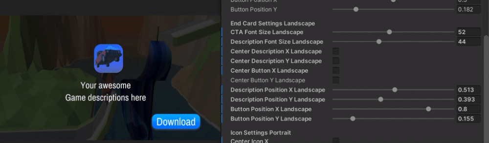
Landscape Settings
Use this settings to test the landscape orientation of your playable.
These settings function in the same way the The landscape settings are separated from the portrait fields in the inspector. In this way, you are able to create a different behavior for your end card when the user is using landscape orientation.
If you are using a portrait orientation the landscape settings will not update the end card's features.
Clickable Options
In this field, you can specify which part of the end card will be clickable and linked to the app store.
| Options | Details |
|---|---|
CTA Button Only | Only the CTA button will be clickable in the end card. |
Fullscreen | The entire screen will be clickable in the end card. |
Fire App Stop Click On Show | This options will automatically click on the end card when it is shown for the first time. |
Animation Settings
The end card builder also provides different animations for the CTA button and the end card entry.
| Field | Type/Options | Details |
|---|---|---|
| Button Animation Type | - None - Wobble - Scale - Opacity | The animation for the end card button. The default value is Wobble. You can check them here. |
| End Card Portrait Animation Type | - None - Slide Top To Bottom: The end card enters from the top of the screens going towards the bottom - Slide Bottom To Top: The end card enters from the bottom of the screens going towards the top - Scale : The end card enters in the scene by expanding from the middle of the screen until it reaches the required measurements. | The appearance animation type for the end card in portrait orientation, which controls show the end card arrives on screen. Default value is Slide Top To Bottom. You can check them out here. |
| End Card Landscape Animation Type | - None - Slide Right To Left: The end card enters from the right of the screens going towards the left side. - Slide Left To Right: The end card enters from the left of the screens going towards the right side. - Scale: The end card enters in the scene by expanding from the middle of the screen until it reaches the required measurements. | The appearance animation type for the end card in landscape orientation, which controls show the end card arrives on screen. Default value is Slide Right To Left. |
Button Animations
- Wobble
- Scale
- Opacity
End Card Entry Animation
- Top To Bottom
- Bottom To Top
- Scale